Rather than prettifying all plots in Illustrator, I prefer doing as much as possible already in Matlab. Chances that you’ll have to regenerate the figures at some point (because you decide to change one step somewhere in your analysis pipeline, say…), and by scripting the plots as much as possible you can replace your pdfs with an updated one with just one click.
Here, I’ll make an overview of several types of plots I use a lot, and my strategies for making them look good. Some final touches in Illustrator might not be possible to avoid, but this should get you quite far.PS1: This tutorial relies on Matlab’s new graphics engine that was introduced in version 2014b. If you’re still using an older version, please upgrade – it’s worth it! The figures shows were generated using 2015b on a Mac OS X El Capitan.
PS2: many of the functions I use come from the file exchange, and can also be downloaded from Github (especially the plotting subfolder). Of course, make sure that they are actually on your matlab path before starting. To make all the plots below, you will need: cbrewer, ploterr, suplabel, rddiffci, mysigstar, distributionPlot or my own adaptation violinPlot, and scatterHistDiff.
You can download the full Matlab tutorial script here, and run it for yourself rather than copying the parts. Happy plotting!
Update: Sebastian Lehmann pointed me to the gramm plotting library, which mimicks ggplot’s behaviour in Matlab. The examples look great and might replace a lot of the manual code below – so if you’re starting with a new data viz project, definitely worth checking out!
Update 2: for general data visualisation tips and tricks, check out this great blog by Gabriela Plucinska.
GENERAL
The settings here are best suited to subplot(4,4,x), which makes them about the right size for publishable-size figures when saved to an A4 pdf. I have this in my startup.m file, so I don’t have to retype these things whenever plotting a new figure.
% general graphics, this will apply to any figure you open
% (groot is the default figure object).
set(groot, ...
'DefaultFigureColor', 'w', ...
'DefaultAxesLineWidth', 0.5, ...
'DefaultAxesXColor', 'k', ...
'DefaultAxesYColor', 'k', ...
'DefaultAxesFontUnits', 'points', ...
'DefaultAxesFontSize', 8, ...
'DefaultAxesFontName', 'Helvetica', ...
'DefaultLineLineWidth', 1, ...
'DefaultTextFontUnits', 'Points', ...
'DefaultTextFontSize', 8, ...
'DefaultTextFontName', 'Helvetica', ...
'DefaultAxesBox', 'off', ...
'DefaultAxesTickLength', [0.02 0.025]);

% set the tickdirs to go out - need this specific order
set(groot, 'DefaultAxesTickDir', 'out');
set(groot, 'DefaultAxesTickDirMode', 'manual');
A NOTE ON AXES OFFSETS
Unlike seaborn’s ‘despine’, Matlab doesn’t support disconnecting the axes from the origin. I’ve written the function offsetAxes, which removes the x- and y-axes lines from the origin to the first tick mark.
BARPLOTS
I use these settings when preparing bargraphs for publication.

colors = cbrewer('qual', 'Set1', 10);
dat(:, 1) = randn(1, 50) + 10;
dat(:, 2) = randn(1, 50) + 12;

subplot(4,7,6); % rather than a square plot, make it thinner
hold on;
% if we want each bar to have a different color, loop
for b = 1:size(dat, 2),
    bar(b, mean(dat(:,b)), 'FaceColor',  colors(b, : ), 'EdgeColor', 'none', 'BarWidth', 0.6);
end

% show standard deviation on top
h = ploterr(1:2, mean(dat), [], std(dat), 'k.', 'abshhxy', 0);
set(h(1), 'marker', 'none'); % remove marker

% label what we're seeing
% if labels are too long to fit, use the xticklabelrotation with about -30
% to rotate them so they're readable
set(gca, 'xtick', [1 2], 'xticklabel', {'low', 'high'}, ...
    'xlim', [0.5 2.5]);
ylabel('Value'); xlabel('Data');

% if these data are paired, show the differences
% plot(dat', '.k-', 'linewidth', 0.2, 'markersize', 2);

% significance star for the difference
[~, pval] = ttest(dat(:, 1), dat(:, 2));
% if mysigstar gets 2 xpos inputs, it will draw a line between them and the
% sigstars on top
mysigstar(gca, [1 2], 17, pval);

% add significance stars for each bar
for b = 1:2,
    [~, pval] = ttest(dat(:, b));
    yval = mean(dat(:, b)) * 0.5; % plot this on top of the bar
    mysigstar(gca, b, yval, pval);
    % if mysigstar gets just 1 xpos input, it will only plot stars
end
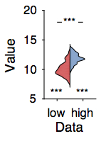
VIOLIN PLOTS
Barplots obscure a lot of the features in your data, since just the mean and sem are poor summary statistics when the data are not normally distributed. I adapted the distributionPlot function to show nicer-looking outlines rather than bar-like histograms.
See #barbarplots for more info.
subplot(4,7,7); hold on;
% rather than a square plot, make it thinner
violinPlot(dat(:, 1), 'histOri', 'left', 'widthDiv', [2 1], 'showMM', 0, ...
    'color',  mat2cell(colors(1, : ), 1));

violinPlot(dat(:, 2), 'histOri', 'right', 'widthDiv', [2 2], 'showMM', 0, ...
    'color',  mat2cell(colors(2, : ), 1));
set(gca, 'xtick', [0.6 1.4], 'xticklabel', {'low', 'high'}, 'xlim', [0.2 1.8]);
ylabel('Value'); xlabel('Data');

% add significance stars for each bar
xticks = get(gca, 'xtick');
for b = 1:2,
    [~, pval] = ttest(dat(:, b));
    yval = max(dat(:, b)) * 1.2; % plot this on top of the bar
    yval = 6; % plot below
    mysigstar(gca, xticks(b), yval, pval);
    % if mysigstar gets just 1 xpos input, it will only plot stars
end

% significance star for the difference
[~, pval] = ttest(dat(:, 1), dat(:, 2));
% if mysigstar gets 2 xpos inputs, it will draw a line between them and the
% sigstars on top
mysigstar(gca, xticks, 18, pval);
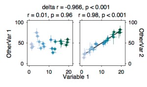
SCATTER PLOTS, LINKED
Show the correlation of X with both Y1 and Y2, and test whether they differ. This is even better when you can get (e.g. bootstrapped) error bars around individual data points.
% between subject stuff
x = linspace(1, 20, 20) + randn(1, 20);
y(:, 1) = 50 + 10 * randn(1, 20);
y(:, 2) = linspace(20, 80, 20) + 4*randn(1, 20);

colors = cbrewer('seq', 'PuBuGn', length(x)+10);
% cbrewer has a bunch of nice sequential colormaps, but I find all of them
% too light (=hard to see) on one side of the spectrum. You can remove this
% part by hand, to skip the whiteish parts.
colors = colors(10:end, : );

for yidx = 1:2,

    thisax = subplot(4,4,yidx); % plot in two subplots
    hold on; axis square; box on;
    xlim([-1 22]);  ylim([-5 105]);

    % correlate the two
    [rho, pval] = corr(x', y(:, yidx), 'type', 'pearson');
    if pval < 0.05, % create my own regression line, or see lsline
    b = regress(y(:, yidx), [ones(length(x), 1) x']);
    plot(x, b(1) + x*b(2), 'k-'); end
    % plot with errorbars for each single subject
    for i = 1:length(x),
        % instead of giving the std from the mean, give the lower and upper
        % bound of each errorbar (for bootstrapped, asymmetrical errorbars)
        h = ploterr(x(i), y(i, yidx), ...
        {x(i) - 1 - abs(0.5*randn) x(i) + 1 + abs(0.5*randn)}, ...
        {y(i, yidx) - 5 - abs(5*randn) y(i, yidx) + 5 + abs(5*randn)}, ...
        '.', 'abshhxy', 0);
        % set colors according to yet another scale
        set(h(1), 'color', colors(i, : ), 'markersize', 12);
        set(h(2), 'color', colors(i, : ), 'linewidth', 0.5);
        set(h(3), 'color', colors(i, : ), 'linewidth', 0.5);
    end

    % !! matlab has a weird bug in their new graphics engine, which leads
    % markers of the type 'o' to be displayed as octagons. This hasn't been
    % solved as far as I know, but in Illustrator you can quite easily
    % select all the points and use Effect > Convert to shape to make them
    % into circles. If you don't need either a white outline or white
    % filling for the markers, '.' will do the job.

    title(sprintf('r = %.2f, p = %.2f', rho, pval), 'fontweight', 'normal');
    ylabel(sprintf('OtherVar %d', yidx));

    % put the y axis on the right, and make sure the label is rotated and
    % moved into the right position
    if yidx == 2,
        ax = gca;
        ax.YLabel.Rotation = 270;
        ax.YAxisLocation = 'right';
        axpos = ax.YLabel.Position;
        axpos(1) = axpos(1) + 2;
        ax.YLabel.Position = axpos;
    end
end

% move the right subplot closer towards the left one
spos = get(gca, 'position');
spos(1) = 0.8*spos(1);
set(gca, 'position', spos);

% shared x label
s       = suplabel('Variable 1', 'x');
spos    = s.Position;
spos(2) = spos(2) + 0.05; % move  up
s.Position = spos;

% test if those two correlations are different using Steiger's test
[rddiff,cilohi,p] = rddiffci(corr(x', y(:, 1)), corr(x', y(:, 2)), ...
    corr(y(:, 1), y(:, 2)), length(x), 0.05);

% plot on top
[a, h] = suplabel(sprintf('delta r = %.3f, p = %.3f', rddiff, p), 't');
set(h, 'fontweight', 'normal');
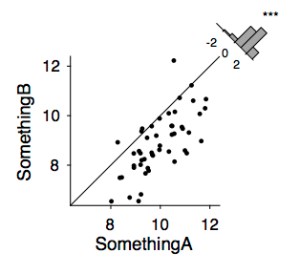
SCATTER WITH HISTOGRAM OF DIFFERENCE
Instead of showing 2 bars with a significance between them (let’s say, condition A > condition B), scatter the two conditions and add the identity line to show that the majority of subjects are on one side of that line. Then add a histogram of the difference, with significance star. See also this tweet.
x = randn(1, 50) + 10;
y = x - 1 + 0.8*randn(1,50);

% set the same data range on both axes
subplot(3,3,4); hold on;
scatterHistDiff(x, y);
xlabel('SomethingA'); ylabel('SomethingB');
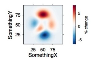
IMAGESC WITH COLORBAR
To plot matrix data, I prefer imagesc over contourf because the former shows the real resolution of the data rather than interpolating.
z = peaks(100);

% choosing a good colormap is especially important for diverging data, that
% is, data that is centred at zero and has minima and maxima below and
% above. cbrewer has a range of nice colormaps.
colors = cbrewer('div', 'RdBu', 64);
colors = flipud(colors); % puts red on top, blue at the bottom
colormap(colors);

% when the data are sequential (eg. only going from 0 to positive, use for
% example colors = cbrewer('seq', 'YlOrRd', 64); or the default parula.

subplot(3,3,6); % take a bit more space here because the colorbar also needs to fit in
imagesc(z);

% note that imagesc cannot handle unevenly spaced axes. if you want eg. a
% logarithmically scaled colormap, see uimagesc.m from the file exchange
% (also included in fieldtrip)

% imagesc automatically flips the y-axis so that the smallest values go on
% top. Set this right if we want the origin to be in the left bottom
% corner.
set(gca, 'ydir', 'normal');
axis square;

% add the colorbar, make it prettier
handles = colorbar;
handles.TickDirection = 'out';
handles.Box = 'off';
handles.Label.String = '% change';
drawnow;

% this looks okay, but the colorbar is very wide. Let's change that!
% get original axes
axpos = get(gca, 'Position');
cpos = handles.Position;
cpos(3) = 0.5*cpos(3);
handles.Position = cpos;
drawnow;

% restore axis pos
set(gca, 'position', axpos);
drawnow;

xlabel('SomethingX'); ylabel('SomethingY');
set(gca, 'xtick', 25:25:75, 'ytick', [25:25:75]);
TIME COURSES WITH SHADED ERRORBARS
See also this blogpost by Guillaume Rousselet for more details on informative ERP plots.

time = 0:0.01:10; % seconds, sampled at 100 Hz
data(:, :, 1) = bsxfun(@plus, sin(time), randn(100, length(time)));
data(:, :, 2) = bsxfun(@plus, cos(time), randn(100, length(time)));

colors = cbrewer('qual', 'Set2', 8);

subplot(4,4,[13 14]);  % plot across two subplots
hold on;
bl = boundedline(time, mean(data(:, :, 1)), std(data(:, :, 1)), ...
    time, mean(data(:, :, 2)), std(data(:, :, 2)), ...
    'cmap', colors);
% boundedline has an 'alpha' option, which makes the errorbars transparent
% (so it's nice when they overlap). However, when saving to pdf this makes
% the files HUGE, so better to keep your hands off alpha and make the final
% figure transparant in illustrator

xlim([-0.4 max(time)]); xlabel('Time (s)'); ylabel('Signal');

% instead of a legend, show colored text
lh = legend(bl);
legnames = {'sin', 'cos'};
for i = 1:length(legnames),
    str{i} = ['\' sprintf('color[rgb]{%f,%f,%f} %s', colors(i, 1), colors(i, 2), colors(i, 3), legnames{i})];
end
lh.String = str;
lh.Box = 'off';

% move a bit closer
lpos = lh.Position;
lpos(1) = lpos(1) + 0.15;
lh.Position = lpos;

% you'll still have the lines indicating the data. So far I haven't been
% able to find a good way to remove those, so you can either remove those
% in Illustrator, or use the text command to plot the legend (but then
% you'll have to specify the right x and y position for the text to go,
% which can take a bit of fiddling).

% we might want to add significance indicators, to show when the time
% courses are different from each other. In this case, use an uncorrected
% t-test
for t = 1:length(time),
    [~, pval(t)] = ttest(data(:, t, 1), data(:, t, 2));
end
% convert to logical
signific = nan(1, length(time)); signific(pval < 0.001) = 1;
plot(time, signific * -3, '.k');
% indicate what we're showing
text(10.2, -3, 'p < 0.001');
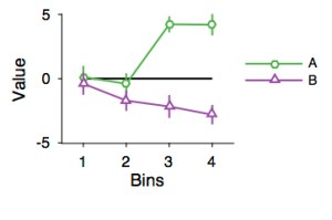
ERROR BARS
Nicer-looking overlapping error bars.
clear xvals yvals;
xvals = 1:4;
yvals(:, :, 1) = bsxfun(@plus, xvals, 5*randn(30,4));
yvals(:, :, 2) = bsxfun(@plus, -xvals, 5*randn(30,4));

colors = cbrewer('qual', 'Set1', 10);

subplot(4,4,16);
hold on;

% show the baseline
plot([min(xvals) max(xvals)], [0 0], 'k-', 'linewidth', 1);

% if plotting in different colors, take into account that people printing
% in black and white (or colorblind people) wont be able to see what you're
% talking about. One solution is to use different markers for each piece of
% data.
markerstyles = {'o', '^'}; % triangular and round markers

% loop over each different-looking errorbar
for i = 1:2,

    % in this case, we don't have any variability on the x axis.
    % therefore, the 3rd argument into ploterr is empty, and only 2 handles
    % (1 for the datapoints, 1 for the y errorbars) are returned.
    h = ploterr(xvals, mean(yvals(:,:,i)), ...
        [], std(yvals(:,:,i)) ./ sqrt(size(yvals, 1)), ...
        '-', 'abshhxy', 0);
    set([h(: )],  'color', colors(i+2, : )); % set a nice color for the lines

    % how does the marker look?
    set(h(1), 'markersize', 4, 'marker', markerstyles{i}, 'markerfacecolor', 'w',...
        'markeredgecolor',colors(i+2, : )); % make the marker open

    % save handle to each line to use in legend
    handles(i) = h(1);
end

% set reasonable y limits
axis tight; ylims = get(gca, 'ylim');
ylim([-max(abs(ylims)) max(abs(ylims))]); % symmetrical around 0

% make the rest look good
xlim([0.5 max(xvals) + 0.5]); % some space at the sides
xlabel('Bins'); set(gca, 'xtick', xvals); ylabel('Value');

% legend, feed the handles to the datapoints rather than the errorbars
l = legend([handles(: )], {'A', 'B'});

% to avoid the legend obscuring the plot, move it to the side
lpos = get(l, 'position');
lpos(1) = lpos(1) + 0.10; % 4 position values: x, y, width, height
lpos(2) = lpos(2) - 0.02;
set(l, 'position', lpos, 'box', 'off');

% note: you can also use legend({'name1', 'name2'}, 'location',
% 'eastoutside') to move the legend to outside the plot. See the legend
% properties help for more names of locations. However, if you're working
% with suplots, using this location argument will fit the legend outside
% your axes but inside the subplot, which squeezes the actual plot to be
% tiny. Manually moving the legend away keeps your axes the same.
WRAPPING UP
% sometimes, axes are plotted in a dark grey thats not exactly black (which
% I find annoying). Make sure this doesnt happen.
axes = findobj(gcf, 'type', 'axes');
for a = 1:length(axes),
    if axes(a).YColor < [1 1 1],
        axes(a).YColor = [0 0 0];
    end
    if axes(a).XColor < [1 1 1],
        axes(a).XColor = [0 0 0];
    end
end

% when you plotted several subplots but want them to have shared axes, use
% suplabel
[ax, h] = suplabel('A bunch of beautiful plots', 'x');
set(h, 'fontweight', 'bold');

% save to pdf
% see also export_fig from the file exchange
print(gcf, '-dpdf', 'BeautifulPlots.pdf');
All of these examples are composed of some tips and tricks that I’ve picked up over the years, and that might be useful to others. Please share your favourite Matlab plotting methods, or let me know if you think I can improve on these figures!

Nice figures, with attractive colormaps! I particularly like scatterHistDiff, which makes a compelling visualisation of pairwise differences. Much more informative than plotting 2 scatterplots side-by-side, even with lines joining the pairs.
Nice stuff. I like getting inspired for new and better ways of plotting data.
Thanks for your contribution. Very helpful!
Randomly fell on this today – this histogram scatter was the plot I didn’t know I wanted!
Thanks, Anne, very useful post years later 🙂