Scientific figures are essential for communicating your research effectively. This guide walks you through the process from raw data to publication-ready figures; and helps separate different phases of the research as we most often carry them out in the lab.
Input gathered from a CoCoSys lab meeting in March 2025.
Phase 1: Data Science (in Python)
Loading and quality control:
- Begin by loading your raw data into Python
Exploratory visualization:
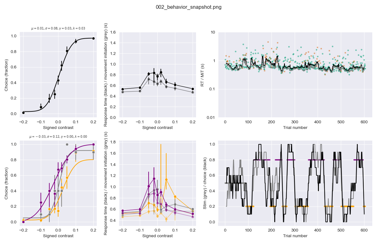
- Perform quality control immediately: early data visualization is crucial for understanding what you’re working with! Ideally, plot ‘snapshot’ figures within a day or week of collecting new data. See https://github.com/anne-urai/human_ibl_snapshots/tree/main/figures for some examples
- Create distribution plots at the individual subject level; plot data over time; see how things correlate. Check for bias, outliers, and unexpected patterns in your data (at levels that are as raw as possible, allowing you to spot things like hardware failures).
- Put effort into making these early plots presentable – they might become Figure 1 in your manuscript or useful for impromptu presentations.
Computation and analysis (the bulk of the ‘real’ work):
- Quality control, preprocessing and data wrangling should never change the original data file but save a ‘clean’ file for further analysis (which is frozen until you run it again to update with incoming raw data). Run your analyses based on your clean, validated data.
- Save transformed data specifically for figure creation: this separation keeps your workflow organized and reproducible.
Phase 2: Data Visualization (in Python)
Developing your narrative:
- Think before you plot! Draw out (on paper/whiteboard) what the data should look like under various hypotheses, and in what way you could inspect the data quality. Anne loves doing this together on a big whiteboard, take a photo and use that as your guide for working towards specific figures.
- Make many visualization versions to map out the potential story of your paper. For instance, plot data over time, between groups, with individual datapoints etc – this helps you identify what kind of visualizations are most helpful for understanding the data.
- After generating various visualizations, decide what’s essential, what belongs in supplementary materials, and what can be removed.
- Of course, don’t look at all your data to generate an hypothesis and then test it on those same data. Keep validation data separate (but do not forget to run the same quality control on it before hypothesis testing).
Establishing a consistent design:
- Decide on figure style elements: colormaps, fonts, font sizes, marker size. Create a centralized ‘config’ file with these style specifications.
- Choose colors thoughtfully; Use colorblind-friendly palette; Avoid non-perceptually uniform colormaps (see: https://colorcet.com/; Ensure figures work in grayscale.
Writing effective figure code:
- Create separate scripts for each figure (e.g., make_figure_1.py)
- Develop template functions for different plot types with sensible defaults
- Use Git version control to track changes and retrieve previous versions if needed
Ensuring reproducibility:
- Make it clear in your repository where each figure originated
- Ask lab members to run your code and reproduce figures before submission (Anne should be able to run your code and generate the figures before submitting a preprint)
Phase 3: Preparing for Publication (in Illustrator/Inkscape)
See this Illustrator guide by Arjun Raj for very helpful advice.
Minimize manual editing:
- Do as much as possible in code to avoid repetitive adjustments
- Reserve graphics software primarily for schematic figures (illustrations of hypotheses, models, annotations, panel organisatin)
- Document any manual steps required so they can be easily reproduced
Organizing multi-panel figures:
- Decide whether to generate panels separately or create subplots in Python
- Separate panels offer flexibility in arrangement
- Subplots in code ensure consistent spacing without tedious adjustments
Final preparations:
- Add annotations and labels as needed
- Link (rather than embed) plots in graphics software so changes to original files propagate (in case you want to change the axis limits or exclude some strange datapoints, without redoing hours of Illustrator work).
- Only before final submission, embed all elements to make figures self-contained
This broad workflow should help you when you are new to a project, when you are in the middle of data collection, or whether you are writing up.
